■ Redesign | Repositioning
Natrol - brief set by AI
-
Natrol needed to evolve from a dated, clinical supplement brand into a modern, trustworthy sleep brand.
The challenge was to create a platform for a younger audience by shifting the focus from “maximum strength” to mindfulness and sleep routines. -
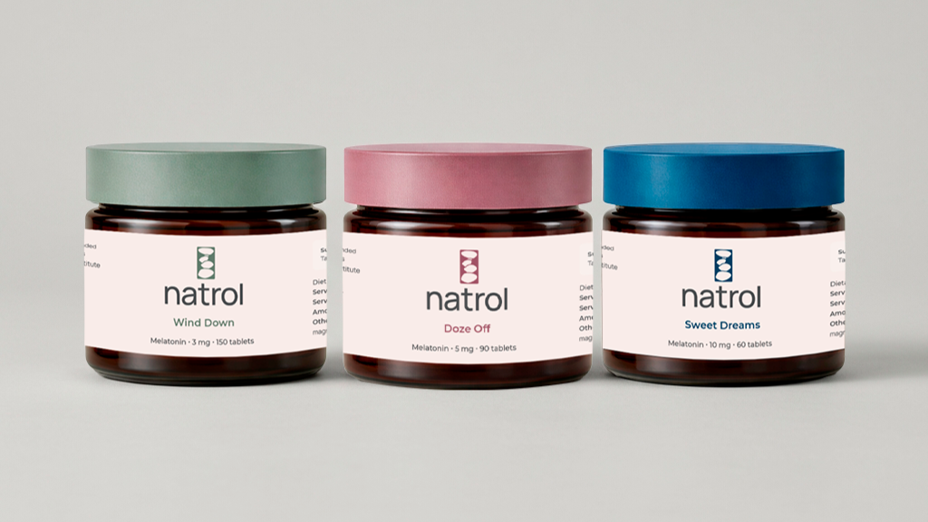
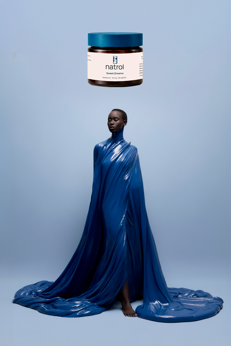
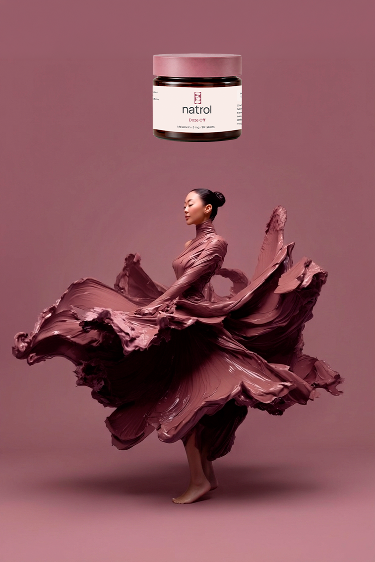
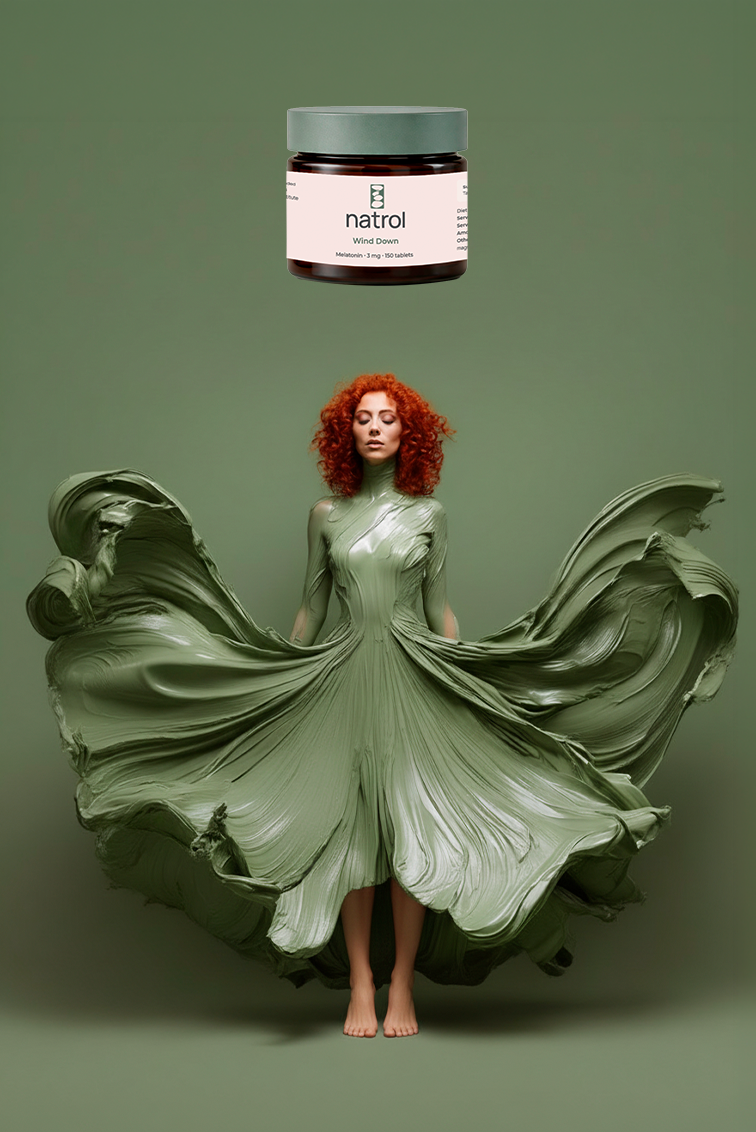
A repositioning of sleep from a functional outcome to an emotional state. Rather than focusing on performance, Natrol becomes part of a calming routine - shifting the brand towards mindfulness, comfort and self-care.
-
The identity was simplified to create a softer, more approachable expression, with minimalistic typography anchored by an abstract symbol inspired by balance and calm. A minimal, beauty-inspired packaging system replaces clinical conventions. Variants are defined through muted colors and translated into campaign visuals. Sculptural, liquid forms of paint create a symbolic link between product and storytelling of being embraced and covered.